If you’re an author (and I assume you must be, or you wouldn’t be wasting your time on this column), words are your primary medium of expression. You use them to set the mood, to evoke emotion, to help readers imagine your characters’ actions. Your success depends on your skill in fashioning worlds with words.
In this age of digital media, though, authors need to deal with pictures as well as text. Surveys have shown that readers pay at least as much attention to a book’s cover as they do to the blurb in making purchase decisions. Adding photos or images to your blog posts or Facebook page helps liven up the content and “grab eyeballs”, in e-Marketing terminology. Reader-oriented websites like Goodreads, Whipped Cream Reviews, The Romance Studio and so on sell advertising space for authors to post book covers or graphical banners, luring viewers to click through and make a purchase. PR types advise that in addition to showcasing your covers, you should have a “head shot”, so readers can associate a face with your name.
All the images you’re likely to deal with in your marketing efforts are digital images, that is, images represented by patterns of bits. (We’ll talk about what that means in a minute.) Unlike photos taken with film cameras, or drawings on paper or canvas, digital images are almost infinitely malleable. They can be enhanced or modified in a wide variety of ways to satisfy different needs.
Unfortunately, this flexibility can come back to bite you. You might submit a head shot to a review site that is showcasing your work and have it come out looking as though you really need to go on a diet:

Or as if you’re an alien from some other star system:

Your cover image might end up being displayed like this, with critical information being hacked off.

Or you might discover that the size of the advertising slot you’ve purchased is just plain too small for your cover to be read.

My goal in this article is to help you understand the source of these image problems, as well as to provide an overview of how digital images are constructed and represented in a computer and how you can get better control over how they look.
I won’t be talking about how to create cover images, by the way, although that’s an important and somewhat related topic. That’s really outside my area of expertise. However, after reading this article, you may be able to better understand why some covers look great even at very small sizes, while others are unreadable.
What is a Digital Image?
An image that can be manipulated by a computer is structured as a two-dimensional matrix of dots, or pixels. Each pixel holds information about a particular location in the image – specifically, information about its color. The figure below shows an image of the letter A which is 8 pixels wide by 8 pixels high.
![]()
Digital images use numbers to describe the color of a particular pixel. Actually, a full color image associates three numbers with each pixel, one of which measures the amount of red in the pixel, one the amount of green and one the amount of blue. You can think of each of these numbers percentages. A pixel that is 100% red, 100% green and 100% blue will be white. A pixel with 100% red and 0% of green and blue will be pure red. A pixel with 100% red, 0% green and 100% blue will be magenta. And so on. The three components mix to produce the final color.
Here’s where the bits come in! You may recall from my first article in the series that computers use a series of bits to represent numeric values, where more bits allows a larger range of values. Digital images often (though not always) use one byte (8 bits) for red, one byte for green and one byte for blue. Each byte can hold a value between 0 and 255.
The colors in the figure above translate to the following values of red, green and blue.
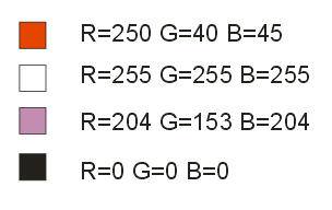
If we allow one byte for each of the three components, we can specify more than 16 million different combinations. This is actually more than the human visual system can distinguish.
Image Resolution
You may notice that my sample letter A abovelooks pretty poor. A matrix only 8 pixels wide and 8 pixels high makes it difficult to show a lot of detail. In general, the larger the number of pixels in an image, the clearer the image will appear, and the more detail you will see. If I double the number of pixels in each direction, I can create a somewhat better looking A, with smoother curves.
![]()
The dimensions of a digital image are called the image resolution. Resolution is usually expressed as W x H, where W is the width in pixels and H is the height in pixels. In general, the higher the resolution, the better the image quality. Compare the clarity of the two covers below. The one on the left is 200 pixels wide by 320 pixels high (200 x 320 resolution). The one on the right has a resolution of 100 x 160, but has been adjusted to take up the same amount of screen area.
 |
 The difference in quality is quite obvious. The difference in quality is quite obvious.
So does this mean you should always use the highest resolution image possible? Not necessarily. There are two additional issues you must take into consideration: screen resolution and file size. Most of the images you’ll use for your marketing – for websites, blogs, or to embed in emails – are intended to be displayed on the screen associated with some computational device: a stand-alone monitor, laptop screen, tablet or phone. The display capability of computer screens is also expressed in pixels. A typical modern LCD screen will have a screen resolution of about 1600 pixels across and 1200 pixels high. The laptop that I’m using to write this article has a 1024 x 780 screen. When you display a digital image on a computer screen, the resolution of the image and the resolution of the screen combine to determine the visual size of the image. For example, if I display a 500 x 400 image on my laptop, the image will take up about a quarter of the screen area – about half the width and half the height. If I had a screen that was 1600 pixels wide, the same image would look smaller; it would take up less than a third of the screen width. Thus, when you’re deciding on an effective resolution for an image, you want to consider what else will be displayed at the same time. You want readers to be able to see the text on your blog or web page, as well as the illustrations! Websites that offer cover or banner ads normally have a standard, required image resolution – usually quite small. They want to be able to fit many images on a single page. The other issue you should think about is how much memory and disk space your image will consume. The higher the resolution, the more space required. For example, if we have a 500 x 500 image, this means we must store 250,000 pixels. Using one byte each for red, green and blue, the basic storage required will be 750,000 bytes – three quarters of a megabyte. If we double the resolution in both directions, to 1000 x 1000, we quadruple the number of pixels, to one million, and we will need three megabytes of space to store the image. Now you may be shaking your head, saying “So what? What difference does it make?” It’s true that these days memory and disk space are relatively cheap. However, in most cases where you’re likely to be using digital images – on a blog or website, or embedded in an email – the image data will be transmitted over the Internet. Including a 1000 x 1000 image on a web page will definitely slow down the display of that page. If your readers are using mobile devices, which have slower download speeds, the impact will be even more serious. In addition, some web hosting companies have limits on how much space you can use. Even Google limits your space on Picasa to one gigabyte (1000 megabytes). That may seem like a lot, but at three megabytes per image, that’s fewer than 400 photos. I took nearly that many on my last vacation! So you may need to balance your desire for clearer, more detailed images against practical issues such as space requirements, download time, and the limits imposed by advertisers or other consumers of your images. Manipulating Images Suppose that you’ve decided to purchase a cover ad at some website. The site requires an image that is 100 x 160 in size. Your publisher has sent you a file that is 800×1280. What do you do? To resize an image, you need appropriate software. You could use a graphics arts program like PhotoShop, but for the most common tasks you don’t need anything nearly as elaborate or expensive. If you work in the Windows operating system, get yourself a copy of IrfanView. This free program is one of the best designed pieces of software I’ve ever encountered. It can reduce or enlarge images, change the color balance or the contrast, sharpen and do other enhancements, convert from one format to another, run a scanner, create a slide show… And it’s so easy to use that even the most dedicated technophobe will find it a snap. If you’re a Linux geek like me, there are a variety of options, including Image Magick and Gimp. These packages have most of the same capabilities as IrfanView, though in my opinion, they’re not nearly as user friendly. On the Mac, I believe you can use iPhoto to modify your images. To change the resolution (and thus the size) of an image, you must specify the new resolution, either in terms of pixels or as a percentage of the original. Be sure you understand which of the two values is the width and which is the height. Most programs display the results, so you can check whether your assumptions are correct, and start over if you guessed wrong. You need to decide whether or not you will maintain the aspect ratio. Aspect ratio specifies the relationship between the width and the height. If you change the aspect ratio, your image may look stretched or squished, like my head shots at the beginning of this article. To determine whether you need to change the aspect ratio, compare the ratio of width to height for the original size and the desired new size. In my example, the original aspect ratio is 800/1280 or 0.625. The ratio for the required dimensions is 100/160, which is also 0.625. To perform this resizing operation, we need to reduce the resolution to 12.5% of the original (100/800) in both width and height. What if the required resolution implies a different aspect ratio than the original? Both IrfanView and ImageMagick (the two programs I use most often for this) have a check box to control the aspect ratio. If the box is checked, you can only change one dimension (either width or height). The other dimension will vary automatically to keep the same ratio. If you uncheck the box, you can vary the width and height independently. A slight change in aspect ratio usually will not cause problems with appearance. I routinely resize the 200×300 covers provided by one of my publishers to the standard 200×320 I use on my website. However, if you discover the resized image looks bad, your other option is to maintain the aspect ratio and then crop the result. Cropping involves selecting a region of an image (usually rectangular) to keep, while throwing away the rest. If you’re working with a cover image, you may be able to identify background areas that you can cut out without seriously harming the readability or the composition. Suppose I have the 200×320 cover image below.
I sign up for a cover ad and learn that the website wants a 100×140 image. This is a significant change in aspect ratio (0.625 to 0.72). When I try do the resizing operation, not maintaining the aspect ratio, the woman on the cover looks pretty chunky.
As alternative, I can resize the original to 100×160 (maintaining the aspect ratio). Then I crop off the top of the cover to reduce the height from 160 to 140.
Does this look better? In the case of this cover, it’s a matter of taste. However, in some cases, the choice between changing the aspect or cropping will be more clear cut. Be sure that you save all the different versions of your image, with different filenames. That will allow you to compare different approaches and decide which ones work best. There are other situations where cropping is useful. If you want to include a photo from your travels, but you don’t want to show your husband’s face (for reasons of anonymity, not because he’s ugly!), you can crop him out. I often use cropping when I download a cover image from the Amazon website to use in a guest’s blog post. The cover images on Amazon include large areas of white background; cropping lets me create an image of just the cover. Remember that earlier I said higher resolution images have more detail. What happens to the detail when you reduce the resolution? Looked at another way, how does the software determine what values to use for the new pixels in the reduced image? The process of calculating new values when changing the image size is called resampling. There are many mathematical techniques for resampling. The simplest will simply average the red, green and blue values for old pixels that are contributing to a new pixel. This generally will not give very good results; the reduced size image will look blurry. Different software uses different methods, some more effective than others. In particular, web browsers have the ability to resample images, but the resulting quality is usually poorer than you’d get with a dedicated graphics program like IrfanView. This is one reason why you should avoid using the width and height attributes on the HTML <img> tag and create your images at the desired size instead. Alphabet Soup: Image File Formats Before I finish, I want to say a few words about different image file formats. You’ve probably heard of JPG and GIF formats. There are dozens of other formats for storing images as well. What is an image format? It is a standard scheme for storing the bits that make up the image. Two different formats may both use one byte each for red, green and blue, but they may pack this information into a disk file in different ways. Usually when you use an image manipulation program like IrfanView, you get to decide what format to use when you save the file. For images that will be used on the web, the three most important formats are JPEG (JPG), GIF and PNG. Modern browsers can display all three. The advantage of JPEG files is that they can reduce the size of an image dramatically, through a process called compression. Compression takes advantage of the fact that pixels in the same region of an image tend to have similar values, so we don’t necessarily need to store multiple copies of the same data. I said earlier that a 1000 x 1000 image would take up three megabytes of disk space, but if stored in JPEG format, the same image is likely to be much smaller. The disadvantage of JPG is that it actually throws away some information as part of the compression, resulting in an image that may be less clear or detailed than the uncompressed version. GIF files also use compression, but without losing information. The main weakness of the GIF format is that a specific GIF file can only hold 256 different colors (as opposed to 16 million). On the other hand, the GIF format has two big advantages. It allows you to specify one color as “transparent”, so that the background will “show through”. This makes it possible to create graphical elements that look as though they have an irregular outline. Also, GIF supports simple frame-based animation, so you can (for example) create a banner that acts like a slide show.
The PNG file format was invented because of patent restrictions that originally encumbered GIF files. PNG files have similar capabilities to GIF (including transparency) but offer more control over color. On the other hand, since they are less common, you may find programs that do not handle them correctly. Worth A Thousand Words… See you next month. Lisabet Sarai “Naughty Bits: The Erotogeek’s Guide for the Technologically Challenged Author” © 2012 Lisabet Sarai. All rights reserved. Content may not be copied or used in whole or part without written permission from the author. |