
Image by martinahavlikova84 from Pixabay
All things considered, I much prefer self-publishing to working with a publisher. I like being able to put out books that don’t fit neatly into someone else’s genre pigeon holes. I appreciate not having to fight with an editor, especially about whether the sex I write is too raw or explicit, or whether I can include LGBTQ interactions in what is primarily a heterosexual romance. Given my busy real world schedule, I’m glad I don’t have to write to someone else’s deadlines. That might make me more productive, but at this point, I really don’t need or want the stress. And of course, I’m happy to get a bigger slice of the pie for each book I sell.
For the most part, in my view, self-publishing is a big win. There’s one area, however, where there are pros and cons: the question of covers.
Every book, self-published or not, needs a cover. And both marketing research and personal intuition suggest that the quality of the cover does affect sales. With all the books available, you need a cover that will grab a potential reader’s attention and communicate the essential qualities of your book – all in a fraction of a second before her eyes flit to the next book on the page.
Having a publisher responsible for your covers is a double-edged sword. On the one hand, it relieves you of a lot of work and/or expense. On the other, sometimes you have to accept a cover you really don’t like. Most publishers do solicit author input on cover art, but they may have considerations other than the story, related to branding, imprints, series, etc. And I’ve observed (unsurprisingly) that the covers coming out of a particular publisher have some tendency to look alike.
When you self-publish, you have much more control, but you must either purchase a cover (pre-made or custom) or create one yourself. I’ve done both, but I have a pretty limited budget for third-party art. I don’t expect to make a lot of money on my writing (which is more of a beloved avocation than a career), but I don’t want to go into the red. A couple of covers can easily eat up my royalties for a month.
So I’ve been making many of my covers. And I admit, it can be a painful process. I think I have the necessary imagination and artistic perspective, but my practical skills are extremely basic. I also seem to have the devil’s time finding stock photos that satisfy my needs.
Still, I’ve learned a lot in the past few years. Here are a few rules of thumb, based on my observations and experience.
Readability is critical
E-publishing platforms require you to submit a high resolution cover (for instance, 2000×3000 at 300 dpi), but in fact most readers will see your cover as a thumbnail 200 to 300 pixels wide or even smaller. It is essential that they can read the title and the author name, even at this very coarse resolution. It should also be possible to identify the primary images in the cover.
Just for the heck of it, I grabbed the “Trending” covers from the Smashwords home page today.
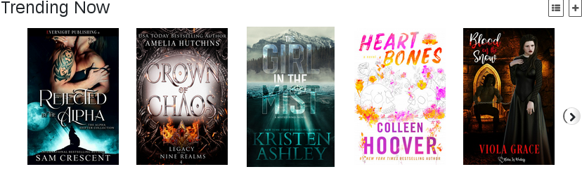
These thumbnails are only 125 pixels wide (click on the plus at the upper right to see actual size) – and some of the titles are close to illegible. (What’s the title of the middle book? The only really clear words are “in the”! And forget about figuring out who wrote it.)
Readability is influenced by font style, font size, font and background color and contrast. The “busyness” of the cover also has an impact; if there’s too much graphical detail the text can get lost.
You want a cover that’s dramatic, arresting, attention-getting – but readability is more important than any of these. The best way to insure readability is to examine your covers at very low resolution. If you can make out the title and author in an image 200 pixels wide, you’re probably doing okay.
Visually signal genre and story content
Most of us at ERWA write what would be considered “genre fiction”: erotica, erotic romance, romcom, horror, science fiction. Every genre has cover conventions, typical styles and image content used by many books. Chick lit, for instance, tends to use cartoonish drawings in bright colors rather than photo-realistic imagery. This is often true of cozy mysteries as well (though the image content will be different), but not more serious mysteries. Romance covers usually feature photos of the protagonists, often though not always in an embrace. Naked, muscled, headless male torsos are also ubiquitous.
Here’s a quick screen capture from my romance publisher, Totally Bound.
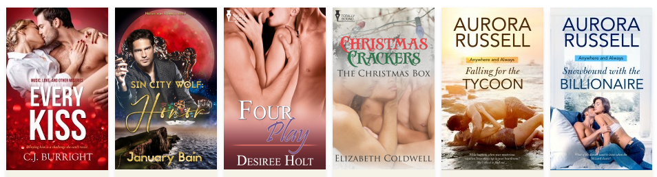
The color schemes often signal the sub-genre, with darker shades for suspense or paranormal. For some reason romance covers also often have a lot of background detail as well. It’s very common to have an image of the setting, whether it’s a city skyline or a windswept prairie, behind the central figures.
Erotica covers, of course, tend to push the envelope, focusing in on seductive body parts as much as on faces. The covers are intended to arouse the reader, hopefully without attracting the scrutiny of the censors.
If you are creating your own covers, you need to decide how closely you will follow the current trends. You want readers to be able to identify what sort of story you’ve written, but you don’t want your cover to blend into the crowd.
This is a tough guideline for me to follow. First, many of my books don’t fit neatly into a single genre. A lot of my work straddles the fuzzy line between erotic romance and erotica. I also work in many secondary genres: sci fi, steam punk, paranormal, and so on. I struggle to create covers that capture the essence of my titles.
Sometimes it may be more important to you to convey the tone of the book than the genre. I recently published a new edition of my M/M paranormal erotic romance Necessary Madness. Although this novel is definitely romance, in the sense that it focuses on a single developing relationship (and even ends with a wedding), its a rather dark book that includes some very intense episodes: horrific visions of disasters, scenes set in a psychiatric hospital, and satanic rituals.
Here is the original cover, from Totally Bound, a very traditional romance cover, without much indication of the paranormal sub-genre. (I should say that I was able to choose the images of the heroes as part of this design.)

Here’s the new cover I created. I’ve focused much more on the paranormal aspect here. There’s even an echo of horror, which in fact is fitting to the story. I don’t even include an image of the second hero.

I don’t know which cover is better, but they definitely send out different signals.
Be distinctive and original – but not too subtle
Those of you who’ve known me for a while are quite familiar with my contrarian tendencies. Hence I’m more likely than not to stray away from the genre norms in choosing or creating my covers. Sometimes, though, it’s possible to be too subtle.
Here’s a cover I adore, for the first edition (2016) of The Gazillionaire and the Virgin, created for me by Willsin Rowe.

This is pure BDSM romance, sweet as well as hot, which turns the Fifty Shades of Grey stereotype on its head. Willsin deliberately designed this to visually echo the original Fifty Shades cover, with the gray necktie.

I thought this idea was brilliant. However, in retrospect, I doubt anyone else noticed.
In contrast, here’s the cover I did for the second edition, which was released on Valentine’s Day.

This cover screams erotic romance (at least to me). Furthermore, even though there’s not a handcuff or riding crop to be seen, I think (or at least hope) that the positions of the man and woman, and their expressions, suggest a power exchange relationship.
Series covers need a visual theme
For most of my writing career, I wrote standalone titles. I honestly couldn’t imagine writing a series; when I finished a story, it felt complete and I didn’t have any ideas for follow-on books.
A few years ago, that somehow changed. I found myself typing “The End”, then almost immediately starting to dream up new situations and characters in the same fictional world. My longest series so far, Vegas Babes, includes five books (and I have some rough ideas for a sixth, if I can ever find the time to write it).
If possible, the covers in a series should have some similar elements, to communicate the fact that this is somehow a connected set of titles. However, when I wrote the first Vegas Babes book, Hot Brides in Vegas, I didn’t realize this would be a series. Hence I had to adapt the later covers to the mood and visual theme of the first book cover: mostly blank background, beautiful women, and a specific set of fonts.


Of course, one advantage of self-publishing is that you’re never stuck with a particular cover. It’s fast and easy to change the cover on Amazon or Smashwords. (Good thing, too, because sometimes the censors will force you to make a switch!) Still, retrofitting a cover to match a series theme isn’t a trivial effort.
When I started The Toymakers Guild, I had a three-book series in mind. Here are the first two covers. Much more similar than the Vegas Babes, but I’ve actually had considerable difficulty finding appropriate foreground figures. I still haven’t located a woman for the third cover (though that won’t be an issue for a while!)


For erotica, expression is more important than bodies
Since most of you write erotica, I’ll end with this guideline. This is purely a personal belief. I do not have any evidence to support it. However, for me, sexy bodies or poses do nothing to excite my interest unless they’re accompanied by a genuinely provocative or aroused expression on the part of the models.
Here are a couple of my favorite covers by other members of ERWA.


I love both of these because of the emotions I read in the women’s faces. In the Hired Help cover, the woman is believably transported by lust. At the same time, there’s an aloofness that matches the character in the story.
The main character in the Nina cover has a more ambiguous look. She’s not sure what she’s getting into – but she thinks she likes it!
In my view, if your cover characters look aroused, your readers will be, too.


Great post on picking out a cover for the aspiring author. You made a number of salient points that are good to keep in mind. Especially cost as most of us will hopefully end up in the black at some time.
Thanks for liking the cover of “Nina the Fallen Ballerina.” That’s one of my favorite covers also.
Thanks, Larry! You’ve got an eye for women with great expressions. I love the cover of your new book, Company Benefits!
“I’m far less interested in what happens to my characters’ bodies than in what goes on in their heads.”
Exactly!
Still, I believe much can be said for visual representation – not just in erotica, but in all genres. Perhaps I’m taken back to a time when I was a child, but I always thought that ALL books, hardcover or paperback, should come with more pictures inside the pages. lol
Hello, Manfred,
It’s definitely true that a single picture can tell a story.
I’m more of a verbal than a visual person, but sometimes I’ll encounter a photo, when I’m working on searches for a cover, that stops me cold.
Alas, it’s usually a photo that is not really appropriate for the present task. ;^)
Hi, Lisabet.
I tried to comment here several weeks ago, with no success. Great post.